
| 5 TO 6 AGE CATEGORY | |||
| # | NAME | TOTAL SCORE | PLACE/AWARD |
| 1 | Veronica Fet | 11.3 | III |
| 2 | Jacob Fet | 11 | Honorable Mention |
| 3 | Jocelyn Yu | 15 | I |
| 4 | Rui Wang | 11.3 | Honorable Mention |
| 5 | William Jin | 11.3 | Honorable Mention |
| 6 | Parker Souder | 11.3 | III |
| 7 | Albert Roytburd | 11 | Honorable Mention |
| 8 | Katherine Kozlov | 11 | Honorable Mention |
| 9 | Sonya Tchoujtchenko | 10.3 | Honorable Mention |
| 10 | Jacob Geller | 10 | Honorable Mention |
| 11 | Claire Karabet | 11.3 | Honorable Mention |
| 12 | Marina Borodin | 11.6 | II |
Thank you to everyone for your participation in our very first photography contest!
Let us start with this amazing quote:
“You don’t take a photograph, you make it.” – Ansel Adams
There are many and many aspects involved in the process of the image creation. Everything starts with an idea, of course. It could be an idea of a single image, it could be an idea of an entire session (street photography, for example).
Then we get the camera and start “writing down” images of the real world around us. After we done with the “recording” process we get in front of computer (or we go to our darkrooms in case of film) and start analyzing the material.
Then we try to make our images speak for us.
Yes, dear friends, photography is the language. Same as English, Spanish, French, German, Chinese, Hebrew, Japanese, Arabic, Swahili, Italian, Greek … you name it.
This language doesn’t require interpreters if spoken perfectly – you will be understood right away by any human being all over the world. Everyone is looking for peace, beauty, happiness, balance, positivity. Everyone is looking for hope.
Camera is your first friend in this case, like pens for writers, like brushes for painters, like chisels for sculptors. It takes time to learn how to use this tool, but trust us – there will be the day when you wake up, get you camera, start photographing … and you suddenly realize that your camera speaks. And everyone around you understands what it says. But this isn’t a camera – this is you speaking!
Let’s get back to business 🙂
Below please find some short notes about everyone’s work. Our opinions aren’t final at all, so please don’t considered them as a verdict 🙂
But based on our experience of living in the wonderful world of photography for a quite long period of time everyone of you might find them helpful.
And stick with your teachers, study ancient arts regarding lighting and composition, read books.
Please 🙂
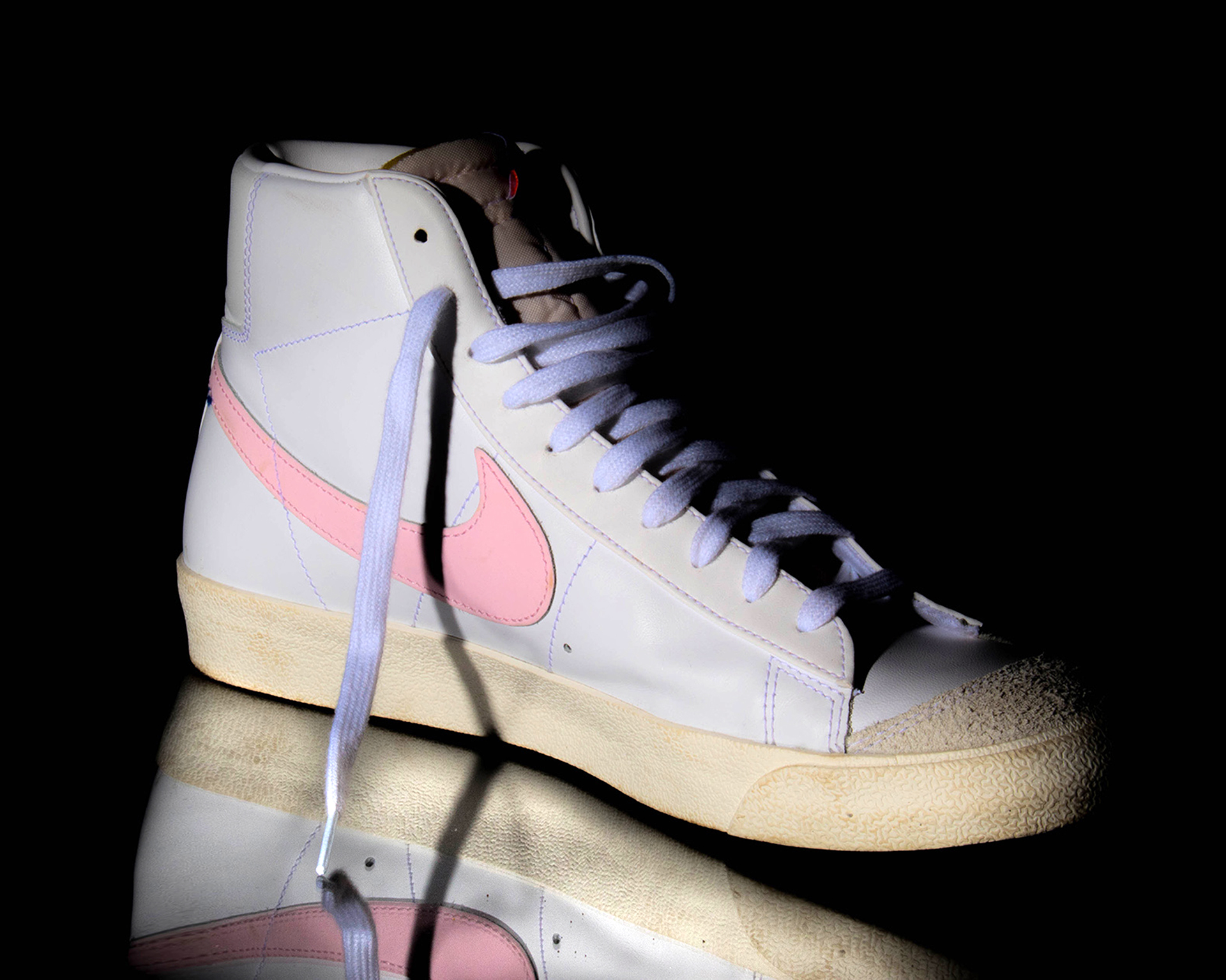
Hunter P.
Very good quality, impressive results of working with red specifically. Red color is being considered as the most difficult color to work with, and your results are amazing.
Images might work well as stock photos, but we suggest to experiment more with models. Poses, face expressions, something which will make images look less tense. We see great potential in your work, Hunter!
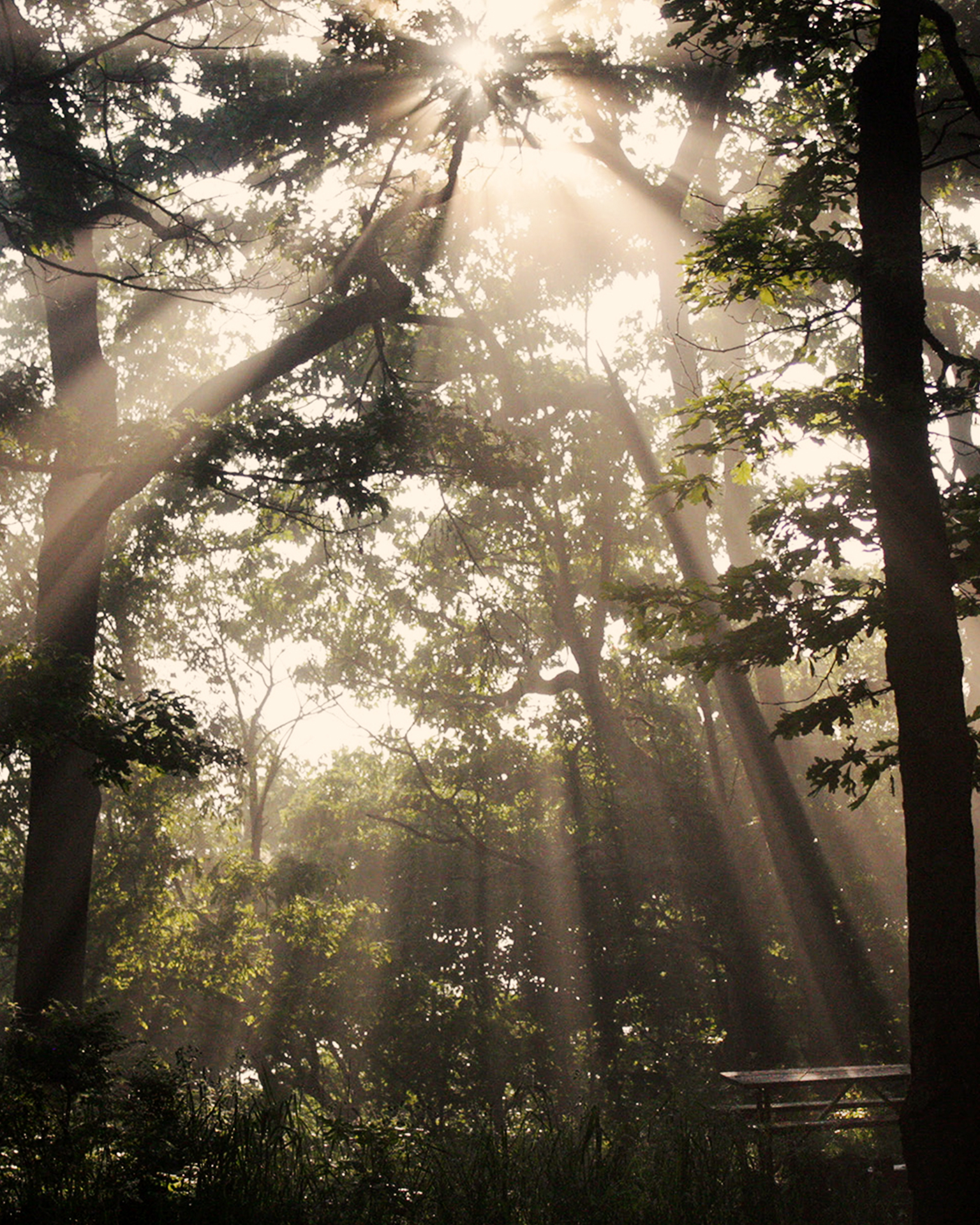
Ciara M.
We really like sun rays in image – smoke from campfire made them truly visible. We would suggest “playing” with composition. We took responsibility and decided to offer some cropping. There are some details in image which don’t play any role in it (a part of the red tent), so they can be easily cropped out. We like the bench, some dodging of surfaces would bring more attention to it and create a logical destination for the flow of light from the top.
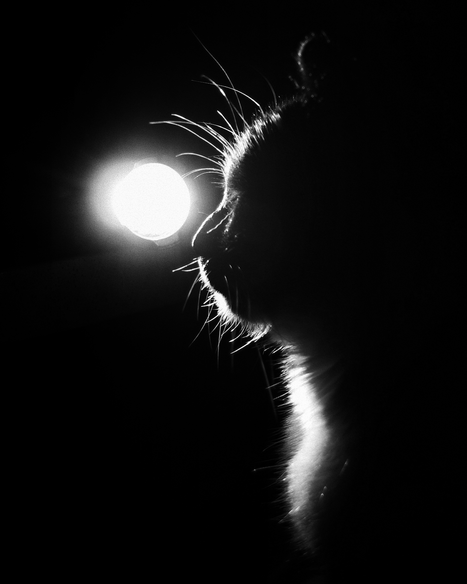
Jada C.
Your “Cat at Night” is amazing!
Our suggestions – cropping (to eliminate unnecessary areas of darkness in the image) and converting to black & white. There are no colors anyway, but the image itself is very graphical, deep and dramatic.
B&W version of it would make a great portrait of your friend!
Riley M.
Would be nice to have more reflection and less of the dark area in image on the left. In this case that would be possible to balance the composition in a better way. Also, the image looks a bit “muddy” now. Using “Auto Contrast” in Photoshop would fix it in a good enough way, Riley.
Jasmin F.
Very good sense of light and colors, Jasmin. The picture with autumn leaves looks more impressive and much cleaner than the other one.
As a suggestion – try to avoid getting out-of-focus objects in the foreground – they draw much of the attention right away and become distractive.
Viewers are subconsciously tempted to get rid of them, but they can’t.
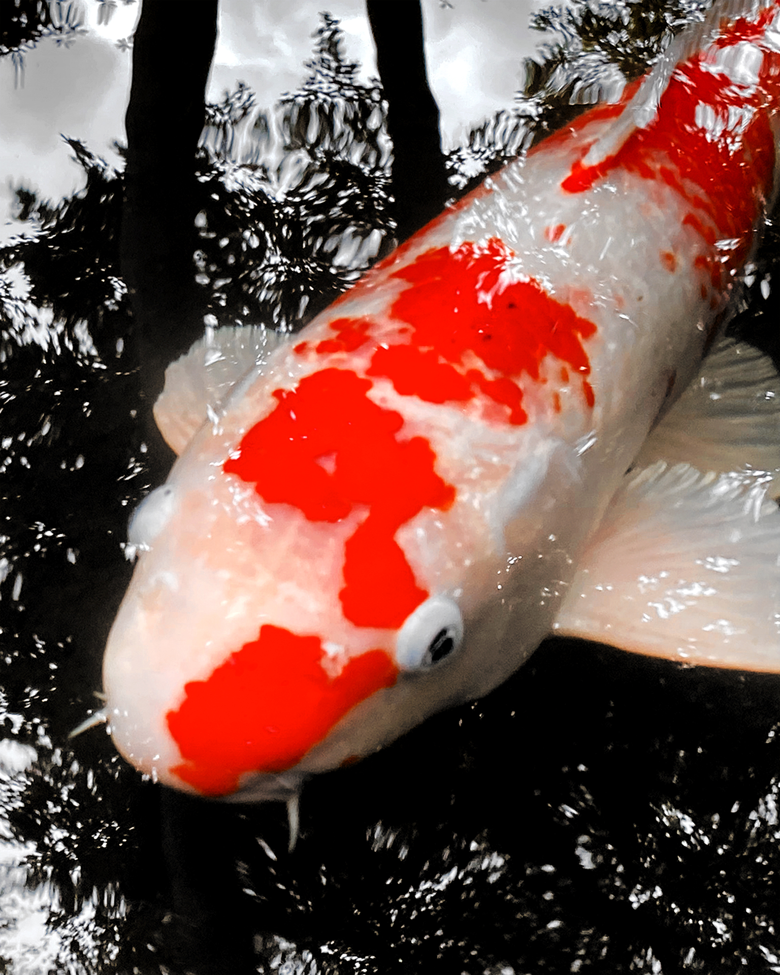
Andres R.
“Birdseye View” could be enhanced a bit. The downside of the picture – the main object (fish) is out of focus. To save the image a bit it is possible to convert water to black and white (as an idea) while making red spots brighter. In this case you might get some kind of abstract effect, viewers’ perception will concentrate on bright red spots, ignoring blurry object. We would suggest to use DSLR and try to focus manually next time. In your case it looks like a mobile phone was used (can’t tell for sure, because there is no EXIF data embedded in the file). Autofocus systems easily get “cheated” by reflections on water surface, and underwater objects come out blurry.
Jose C.
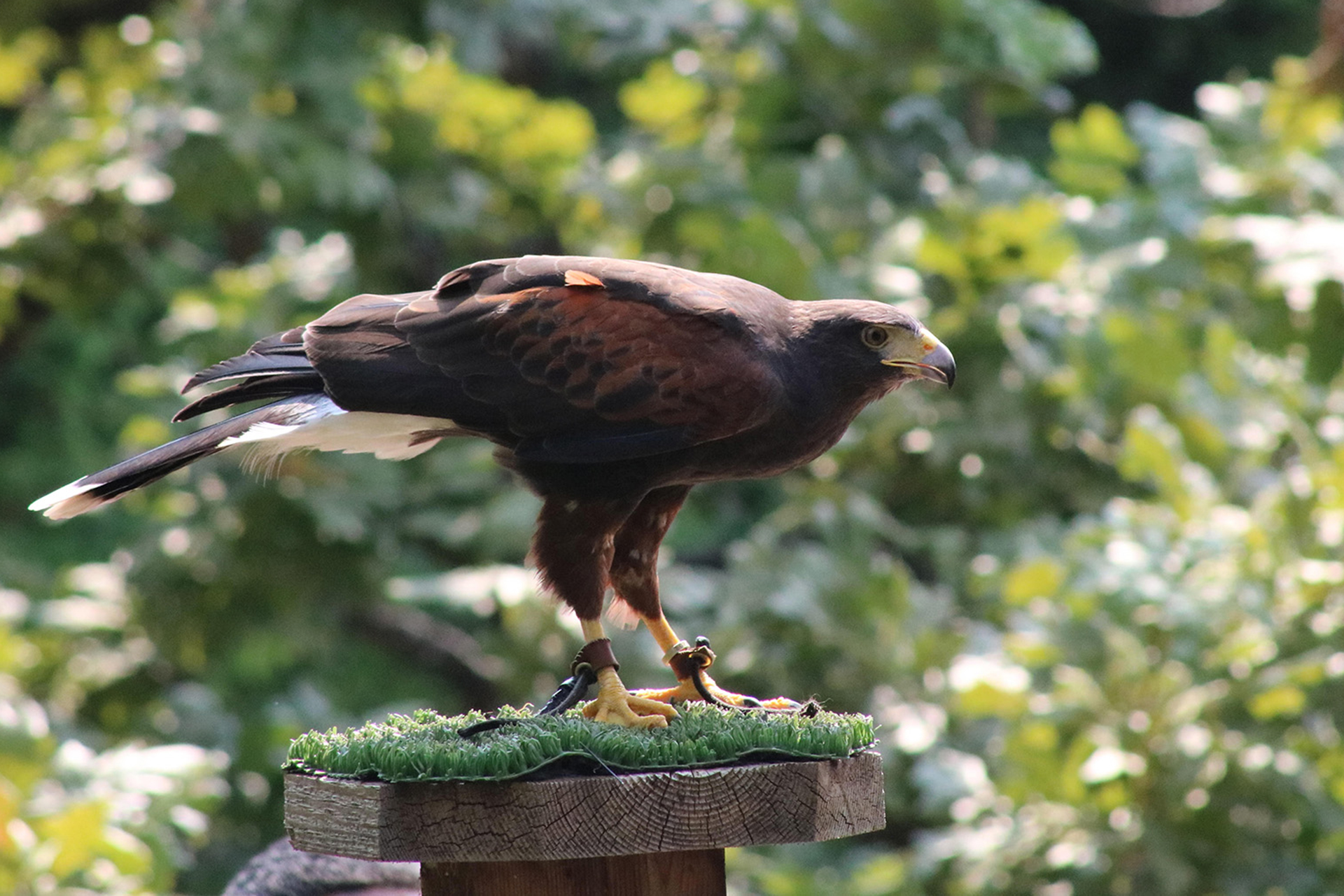
Jose, we would suggest some cropping for the bird. Also, flipping the image horizontally might bring more dynamics to it. In our humble opinion, of course 🙂
We’d love to see armadillo’s face 🙂 Maybe that would make some sense to wait until the guy will wake up?
But don’t knock on the glass – zoo security won’t like it for sure 🙂
Valentina R.
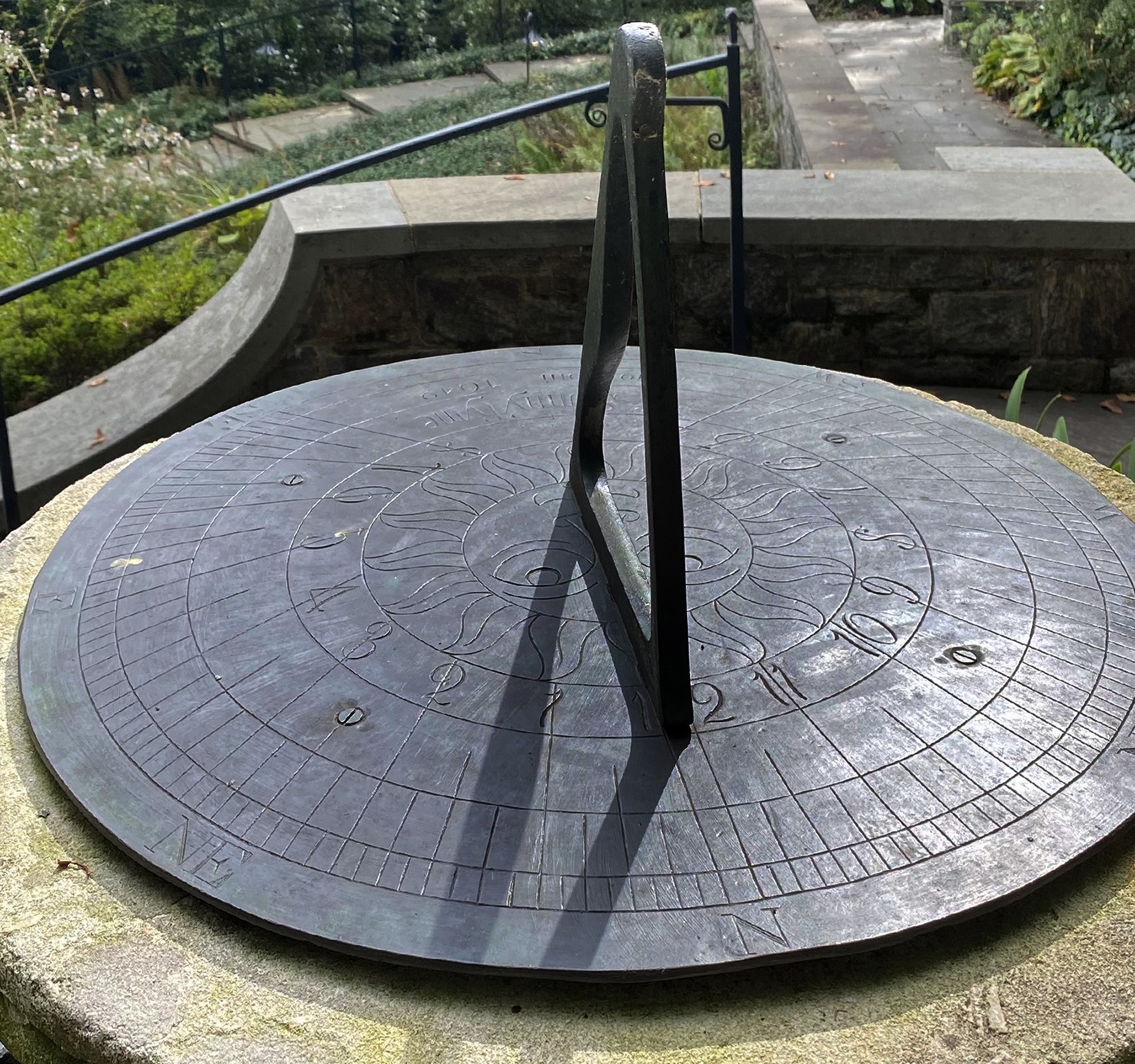
We liked the title – “Time Heals”, but it’s unclear what is being healed according to the image. It might work as an illustration to an essay (words will explain the idea of the Image+Title combination), but not this particular picture alone. Also, we would suggest to fix the image vertically and horizontally, the sundial is falling to the right. Local burning of the plate will also help – this will bring up details on the surface.
“Twilight” is very good. By the balance, composition, colors and overall mood of the picture. No complains at all 🙂 – good job!
Ermina Q.
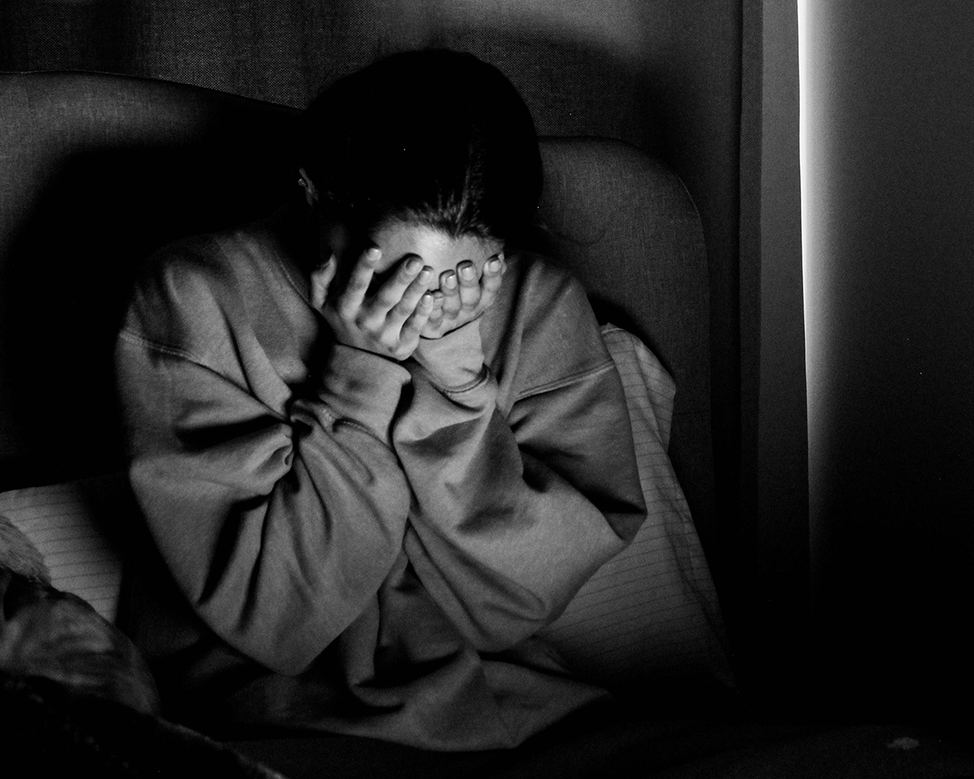
We would suggest cropping for the “Stressed Out”. In this case you will eliminate some extra spaces while keeping the same logic of the composition. At the same time you will bring closer attention to person’s emotions this way.
Dear Ermina, regarding the second image – “Wonderland”. We strongly suggest to submit it for the Visual Arts contest (we are planning it in June 2022). We love the idea, the execution of it (a combination of the inverted background, solarized elements of the temple, and slightly readable contours of “Giant Alice”, but it isn’t a photograph. This is an artistic collage created by using photographic elements, and is the subject for a different contest.
Please feel free to contact us directly at any time should you have any questions.
Aliya C.
“Reflections”. Beautiful, warm color gamma. Balanced and dynamic composition even though it looks static for the first look. A combination of light and shadows creates this pleasant motion effect. Well done, Aliya!
“Fallen on Hard Times”. Our favorite 🙂 One of those images which sink deep into the memory and stay there for a very long time. Hard to explain, but that’s what it is. Frankly speaking, the photograph and the title are so touchy … we would recognize it even 10, 15, 20 years from now should we see it somewhere again.
That’s about it for now, dear friends.
So,
1. The First Place goes to Aliya C. for the work “Fallen on Hard Times”
2. Jada C. (“Cat at Night”) and Valentina R. (“Twilight”) share the Second Place
3. The Third Place goes to Hunter P. for the work “Move”
4. And Ciara M, Andres R, Ermina Q, Jasmin F, Jose C, and Riley M get Honorable Mention status.
Certificates will be emailed out within a week from the mail account info@uidarts.org.
Certificates will be high resolution PDF files, you’ll be able to print them out at any size you want and on any paper of your preference.
Please make sure they won’t get into Spam folders.
Dear Aliya, we’ll contact you regarding the prize.
Next competition will be in spring 2022, probably in April. We will keep you updated, we have some interesting ideas for the future.
Many thanks to everybody again! To participants, to their parents, to their teachers!
Please stay healthy, energetic, cheerful and creative!
The world around us is a Wonderland waiting to be discovered.
Although it is a total chaos for the first look – it structured out of perfect in balance and composition fragments of reality.
And those fragments, those tiny gems reflecting the overall hidden perfection of life – your future images.
Dear children, parents, teachers!
First of all, many and many thanks to our sponsors – The City of West Hollywood, Golden Key Art School, American Academy of Fine Arts!
Finally we came up with the results of this year’s Colibri 2021 Visual Art contest!
That was a quite difficult journey for us, judges and organizers, simply because ALL artworks are just amazing!
At the same time competition is competition, but we decided to combine an official part with the art gallery,
where would be no differences in skills, techniques, or media used.
And you will see how beautiful the world around us is reflected in eyes, hearts and souls of young artists.
You will see how deep sometimes they are, how fragile and how strong they are at the same time.
Every single participant will receive certificates in addition to prizes mentioned in rules and on this page.
Also, we are working on design of special Thank You letters for those who joined this Competition for the second time.
We truly appreciate your participation, support and good vibes.
We consider our entire Colibri Program as a beautiful brigantine under scarlet sails bringing all of us to the bright future free of hate and lies.
Also, you are more than welcome to join us in PHOTO contest – we just opened it two days ago – “LIGHT AND SHADOW”.
And now please take a look at the results of this competition, and then please visit the art gallery we made!
2021 VISUAL ART COMPETITION RESULTS PAGE >
2021 VISUAL ART WINNERS GALLERY>
Thank you so much to everyone again!